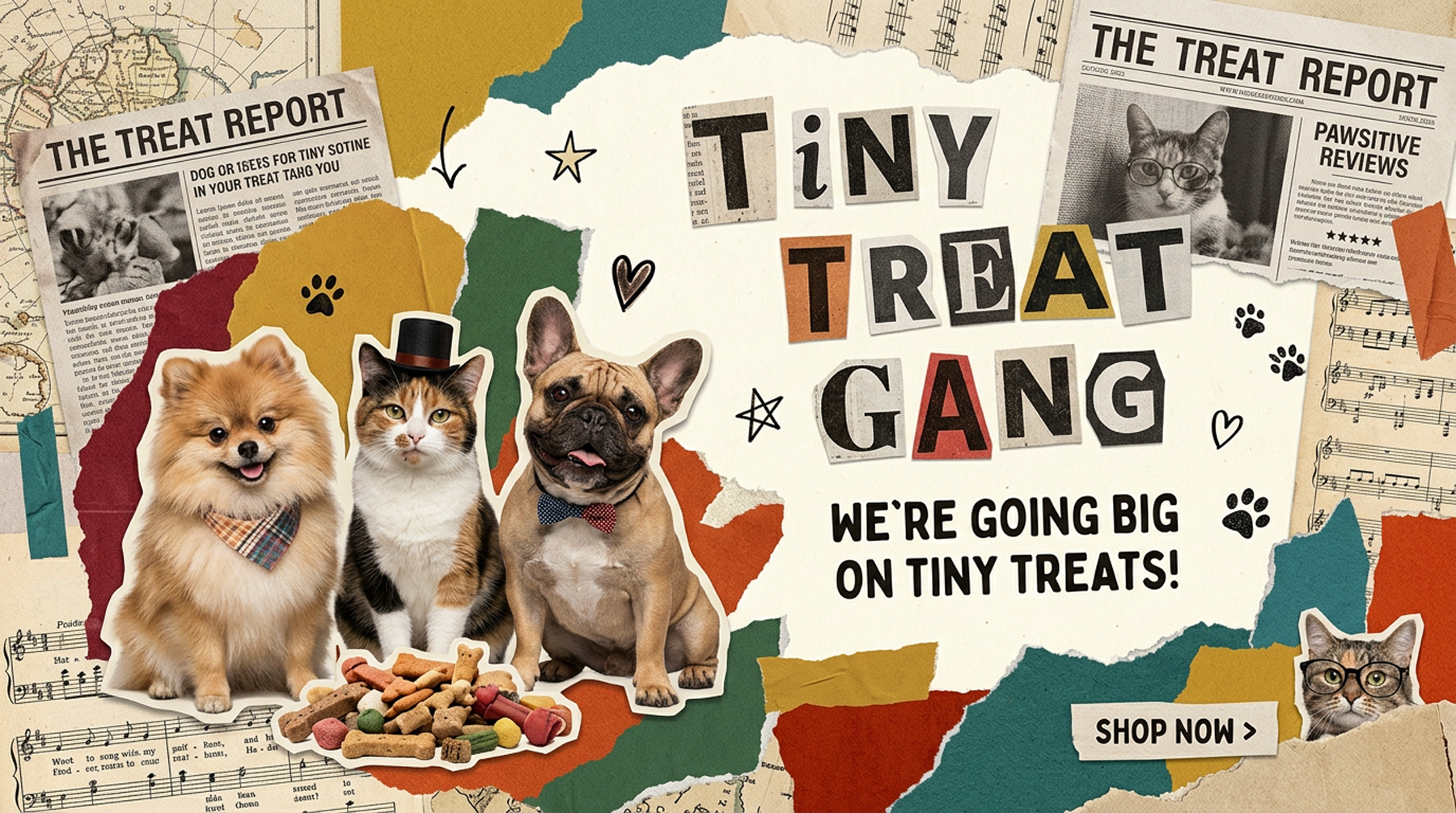
How “Curated Chaos” Was Turned into a Brand
The proof – a case study
How Tiny Treat Gang Turned ‘Curated Chaos’ into a Brand
Most subscription boxes make the same promise: everything inside will be coordinated, matched, and perfectly on-theme. Tiny Treat Gang made a different bet. Instead of polishing every box into a predictable set, the brand built itself around the opposite idea. Pets, and the people who love them, don’t want predictable. They want a little surprise every month. That single strategic decision became the foundation for everything that followed: the identity, the tone, and the entire customer experience.
This case study walks through how that idea took shape, from the initial challenge through the finished brand.
The Challenge
Tiny Treat Gang came to us as a pet subscription box concept in a crowded category. Pet subscription boxes are everywhere now, and most of them look remarkably similar. Soft pastel palettes. Tidy product photography. A curated collection of toys and treats arranged just so. The category had settled into a kind of visual sameness, where one brand’s Instagram feed could easily be mistaken for another’s.
The challenge wasn’t just building a brand that looked nice. It was building one that stood out in a market where “nice” had already become the default. A pretty logo and a soft color palette weren’t going to earn repeat subscribers in a space this saturated. The brand needed a reason to exist beyond good design — a genuine point of view a subscriber would notice and remember.
There was also a practical challenge underneath the strategic one. Pet subscription businesses live or die on retention. A one-time purchase is easy. Convincing someone to stay subscribed month after month takes something more than a nice unboxing once. It takes anticipation — a reason to look forward to what’s coming, even without knowing exactly what that is.
The Strategy
Rather than compete on polish, we leaned all the way into unpredictability. Pets thrive on the unexpected. A dog doesn’t care if a toy matches the treat bag. A cat has no interest in a coordinated color scheme. What pets respond to is novelty and surprise, and that observation became the strategic core of the brand: “curated chaos.”
This wasn’t about abandoning quality or thoughtfulness. Every box is still genuinely curated, vet-approved, and considered. The difference sits in how that curation gets framed. Instead of promising a perfectly matched set every time, Tiny Treat Gang promises variety, discovery, and the kind of playful unpredictability that mirrors how pets experience the world.
That shift in framing did something important for retention, too. When a subscription box’s whole value rests on a perfectly matched set, a subscriber who doesn’t love one color scheme has a reason to cancel. When the value rests on delightful surprise, the brand builds anticipation instead of expectation. Subscribers stay curious rather than critical.
The Identity
Turning “curated chaos” into a visual identity meant striking a careful balance. Too chaotic, and the brand would read as sloppy or untrustworthy — a real risk for a business selling directly to pet owners who care deeply about safety and quality. Too polished, and the brand would lose the exact energy that made it different in the first place.
The resulting identity leans warm and playful without losing its sense of quality. Bright, tail-wagging color choices sit alongside a clean, trustworthy visual system that signals real care behind the fun — Canadian-made, vet-approved, and built with genuine attention to detail. The system flexes comfortably across two very different audiences, cat parents and dog parents, without splitting into two disconnected brands.
Seasonal offerings needed room to breathe within that same system, too. Paw-liday Packs and Holiday Hauls needed to feel like an extension of the core brand, not a separate seasonal costume slapped onto it. We built that flexibility into the identity from the start, so seasonal collections could feel festive and distinct while staying unmistakably Tiny Treat Gang.
The Application
A strong identity only matters if it holds up everywhere a customer encounters it. For Tiny Treat Gang, that meant building a full ecommerce experience, not just a pretty homepage, designed around the two-audience structure the strategy called for from day one.
Cat parents and dog parents follow separate, clearly signposted paths through the site. That structure runs from the homepage through navigation and into product and detail pages. Each path stays visually and tonally consistent with the other. A visitor never feels like they’ve landed on a different brand depending on which pet they’re shopping for. Product photography and copy throughout reinforce the same “curated chaos” idea set at the strategy stage: playful, a little unexpected, but always clearly premium.
The ecommerce build itself needed to convert casual browsers into subscribers, not just look good sitting still. Every product page carries the same anticipation-building energy the brand strategy set out to create. The site becomes part of the surprise-and-delight experience, not just a transaction point.
The Outcome
Tiny Treat Gang launched with something most pet subscription boxes in this category don’t have: a genuine, ownable point of view. Rather than competing on who can present the most coordinated box, the brand built its entire identity around delight and unpredictability. It’s a strategic choice that turns a monthly delivery into something both pets and their people look forward to.
Every unboxing becomes a small, shared moment between a pet and their person. An ordinary Tuesday turns into something worth filming for social media, worth talking about, worth staying subscribed for. What started as a single strategic insight — that pets thrive on surprise, not sameness — became the throughline connecting the identity, the website, and the entire customer experience.
That’s the real lesson in this case study. The strongest brand strategies rarely come from trying to out-polish a crowded category. They come from noticing what a category has quietly gotten wrong, and building an entire brand around doing the opposite, on purpose.